Waste Management · Web Platform
ServCare Website
One place to book waste pickup, price e-waste and earn reward points.

01
Overview
ServCare is a CPCB-certified waste management service that collects e-waste, plastic, textile waste and used cooking oil from homes and businesses, and rewards citizens with points for what they hand over. The website is the front door: it has to answer three questions fast — do you serve my area, what will you take, and what do I get for it. My job was to turn an operations-heavy recycling business into a booking product a first-time visitor could finish in a couple of minutes.
- Role
- Lead UI/UX Designer — research, IA, flows, UI, design system, handoff
- Timeline
- 4 months (audit → design → launch)
- Tools
- Figma, FigJam, Figma Dev Mode, Maze, Google Analytics
- Platform
- Responsive web platform (servcare.com), mobile-first
02
The problem
- Serviceability is pincode-dependent, so a generic marketing homepage would promise something the operations network could not always deliver.
- Four waste streams (e-waste, plastic, textile, UCO) price completely differently — some per item, some per kilogram — and had to sit in one comprehensible catalogue.
- The reward-points model was the main motivator but was invisible until deep in the old flow.
- Most traffic is mobile, on modest devices, from users who have never used a recycling service before.
- A dark, densely patterned brand world had to stay readable and pass contrast requirements across long catalogue pages.
03
Discovery
Discovery & audit
Sat with the operations team and reviewed support requests to map what people actually ask before booking. The repeating pattern was location first, price second, logistics third — the opposite of how the old site was ordered.
04
Define
The design direction focused on these documented product decisions:
Serviceability is pincode-dependent, so a generic marketing homepage would promise something the operations network could not always deliver.
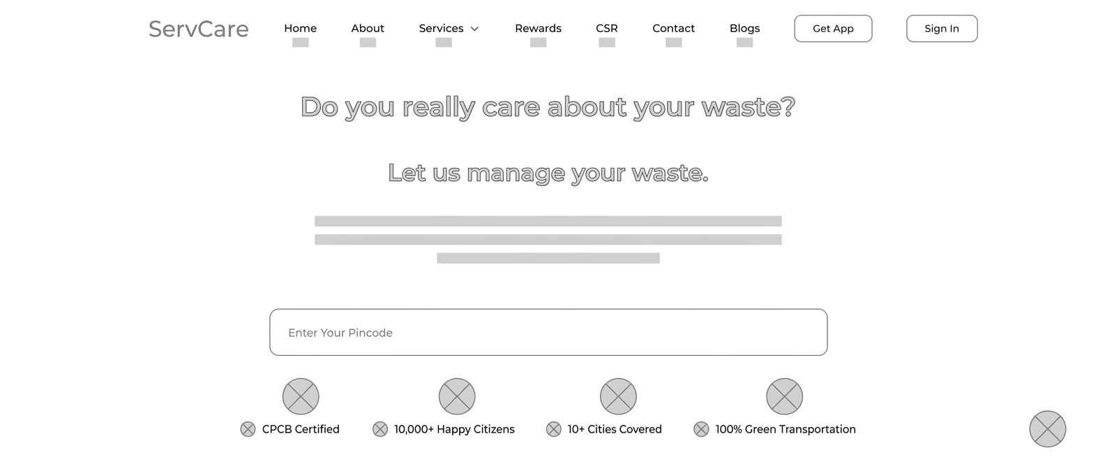
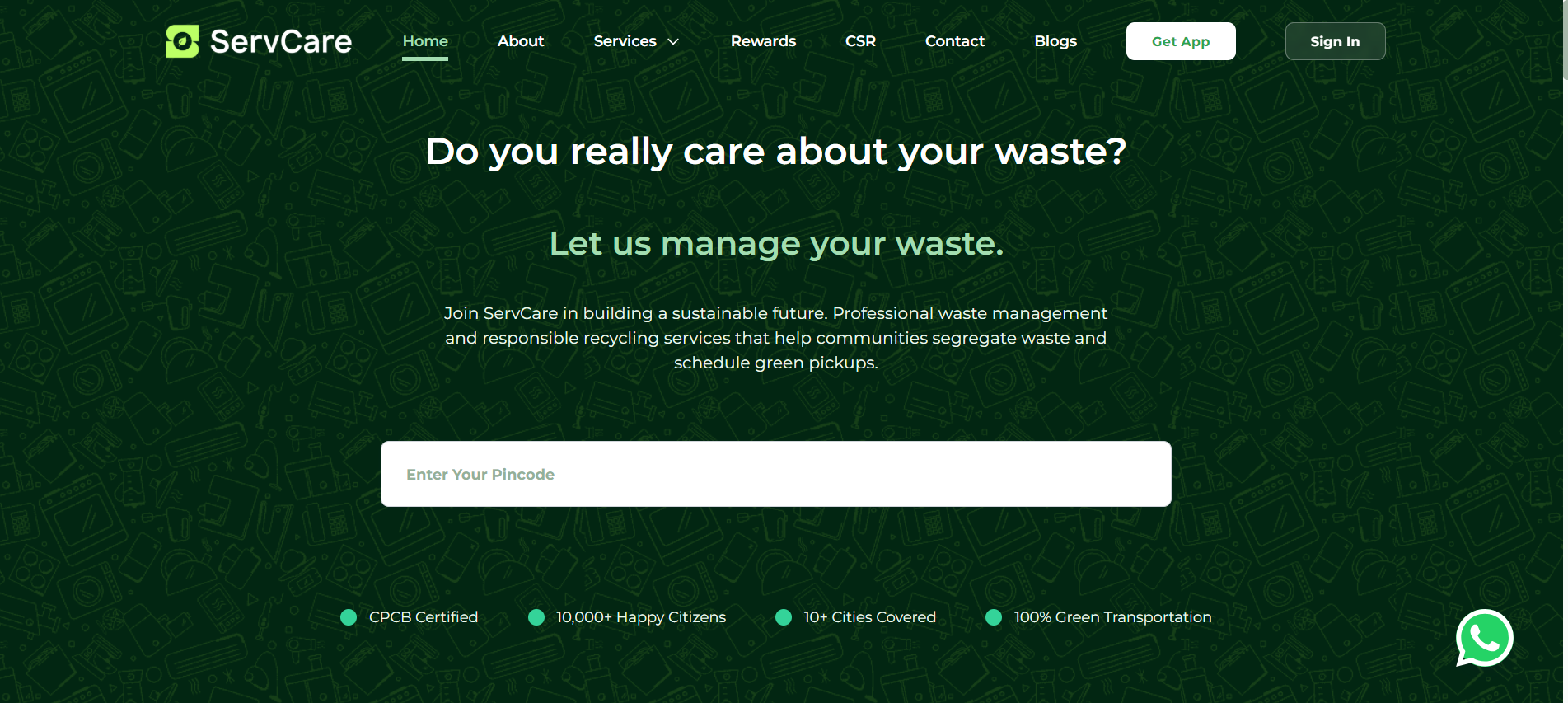
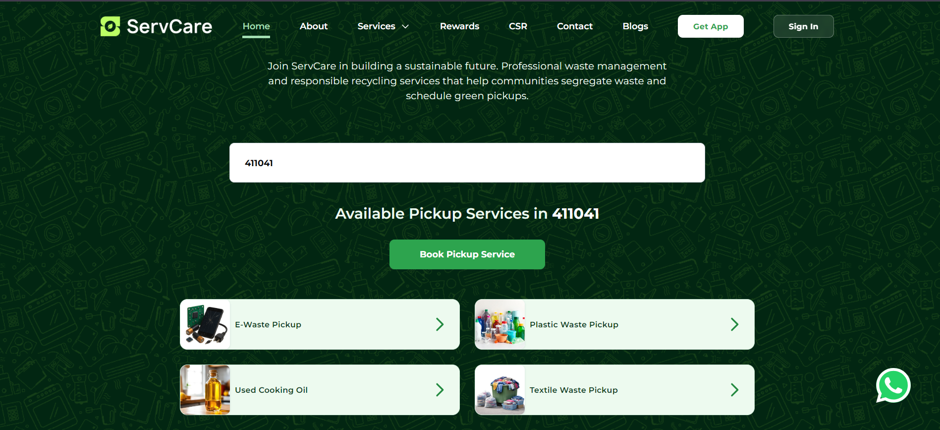
One field answers the only question that matters first. Entering a pincode replaces the hero with 'Available Pickup Services in 411041' and a single Book Pickup Service button.
Four waste streams (e-waste, plastic, textile, UCO) price completely differently — some per item, some per kilogram — and had to sit in one comprehensible catalogue.
E-Waste, Plastic, Used Cooking Oil and Textile pickups appear as illustrated cards with a consistent chevron affordance, so the whole offer is visible in one glance.
The reward-points model was the main motivator but was invisible until deep in the old flow.
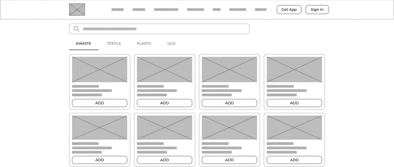
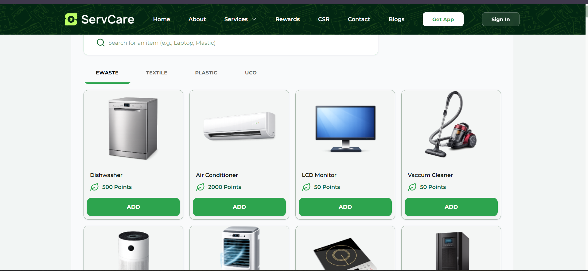
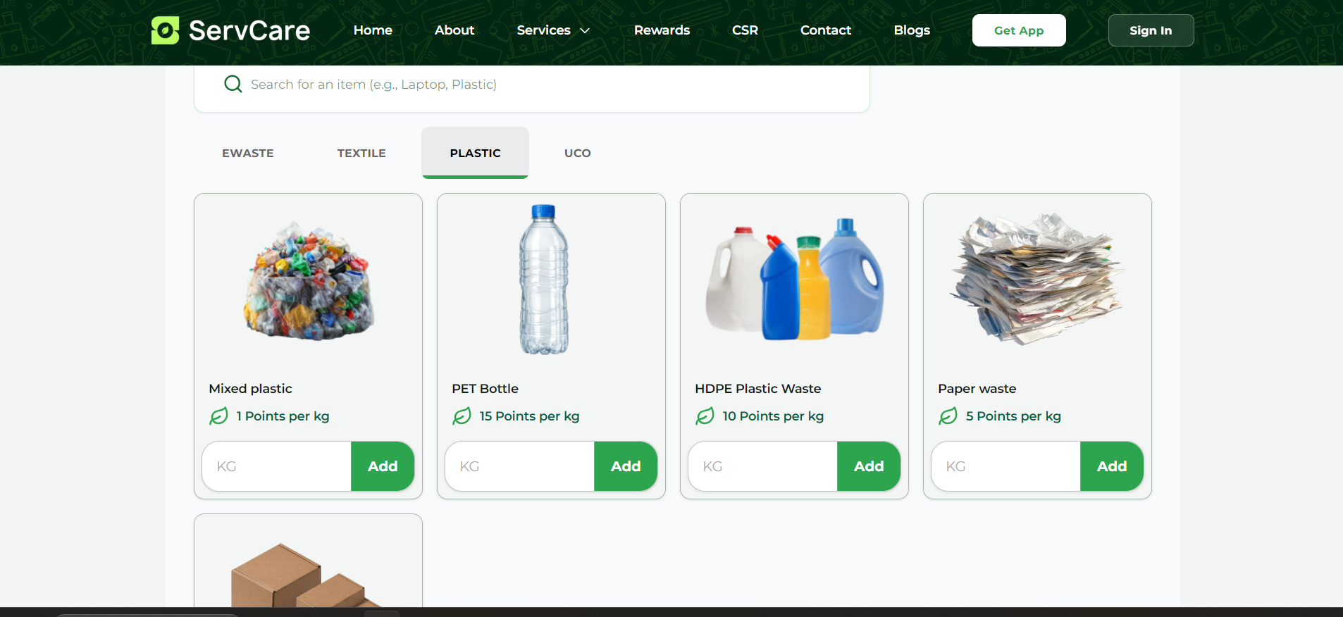
Every catalogue item carries its points value on the card — 500 points for a dishwasher, 15 points per kg for PET — so value is never a surprise at the end of the flow.
Most traffic is mobile, on modest devices, from users who have never used a recycling service before.
A persistent item search sits above the category tabs, letting users who know what they have skip browsing entirely while newcomers still explore by stream.
A dark, densely patterned brand world had to stay readable and pass contrast requirements across long catalogue pages.
Designed a pincode-first homepage, a category-based item catalogue with transparent reward points, and a booking flow that turns a vague intent into a scheduled green pickup.
05
Design process
01
Pincode-first IA
Restructured the homepage around a single pincode input as the primary action, with trust proof (CPCB certified, cities covered, green transportation) directly beneath it, so serviceability is confirmed before any commitment.
02
Catalogue model
Designed a tabbed catalogue — EWASTE, TEXTILE, PLASTIC, UCO — where item-priced categories use an Add button and weight-priced categories use an inline KG field with Add, so two pricing models share one predictable card.
03
Booking flow
Pincode → available services → item selection → schedule pickup → confirmation. Each step shows the running points total, so the reward is visible while the user is still deciding what to hand over.
04
Dark-brand design system
Built a token set on the deep-green brand — surfaces, accent greens, patterned hero treatment — plus reusable service cards, item cards, tabs and search, all specified at AA contrast on both dark and light surfaces.
06
Validation & handoff
Testing, handoff & QA
Ran unmoderated tests on the pincode and item flows, fixed the labels that tested ambiguously, then handed off in Dev Mode with responsive rules and empty/unserviceable states, and QA'd the build across breakpoints.
07
Final UI / key screens
08
Outcome & reflection
Documented project outputs
- 10+ — Cities covered
- 10,000+ — Citizens onboarded
- 4 — Waste streams unified
- <2 min — Pincode to booking
Ordering the page by the user's questions rather than the company's story did the heavy lifting. Putting serviceability first felt risky — it can turn a visitor away in one step — but honest early answers produced better-qualified bookings than a polished pitch ever did.