Mobile · Repair & E-Waste Service
ServCare App
Repair and recycle in a few taps — from diagnosis to doorstep pickup.

01
Overview
ServCare is a consumer app for home appliance repair and responsible e-waste handling — book a repair, schedule an e-waste pickup, sell old appliances, pay online and track everything from one place. The brand promise is sustainability (reduce, reuse, recycle), but the product only earns that promise if the everyday job — getting a broken washing machine fixed — is faster and clearer than making a phone call. My work was to turn a multi-service operations business into a single, calm booking flow.
- Role
- Lead UI/UX Designer — research, IA, flows, UI, prototyping, handoff
- Timeline
- 5 months (discovery → prototype → Play Store release)
- Tools
- Figma, Figma Prototype, FigJam, Maze, Jira
- Platform
- Android & iOS consumer app (ServCare by Muskmelon)
02
The problem
- Multiple services (repair, e-waste pickup, sell appliances, recycling certificates) competing for one home screen without overwhelming a first-time user.
- Repair requests need a lot of information — product, brand, model, issues, address, slot — which is exactly the kind of form people abandon.
- Pricing anxiety: users would not commit without knowing what a visit costs and what it includes.
- Payments, coupons and GST had to be readable at a glance for a non-technical audience across a wide range of Android devices.
- After booking, users had no sense of what happens next, which drove support calls.
03
Discovery
Discovery
Interviewed customers who had recently booked a repair and sat with the operations and call-centre team to log the questions every caller asks. Those questions became the required fields — nothing more was allowed into the flow.
04
Define
The design direction focused on these documented product decisions:
Multiple services (repair, e-waste pickup, sell appliances, recycling certificates) competing for one home screen without overwhelming a first-time user.
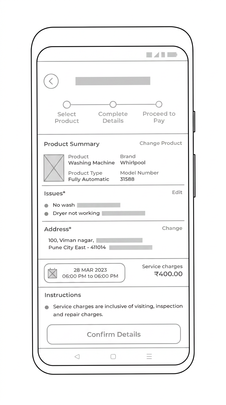
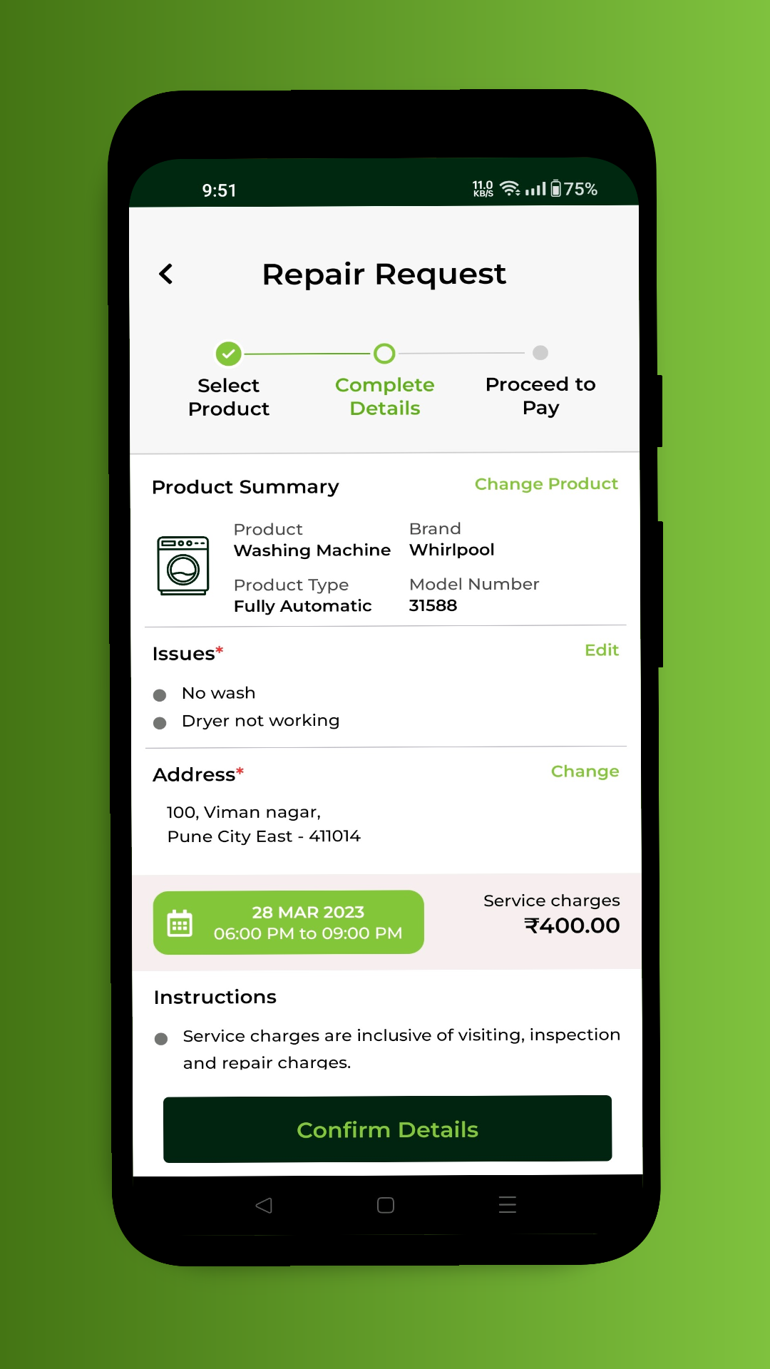
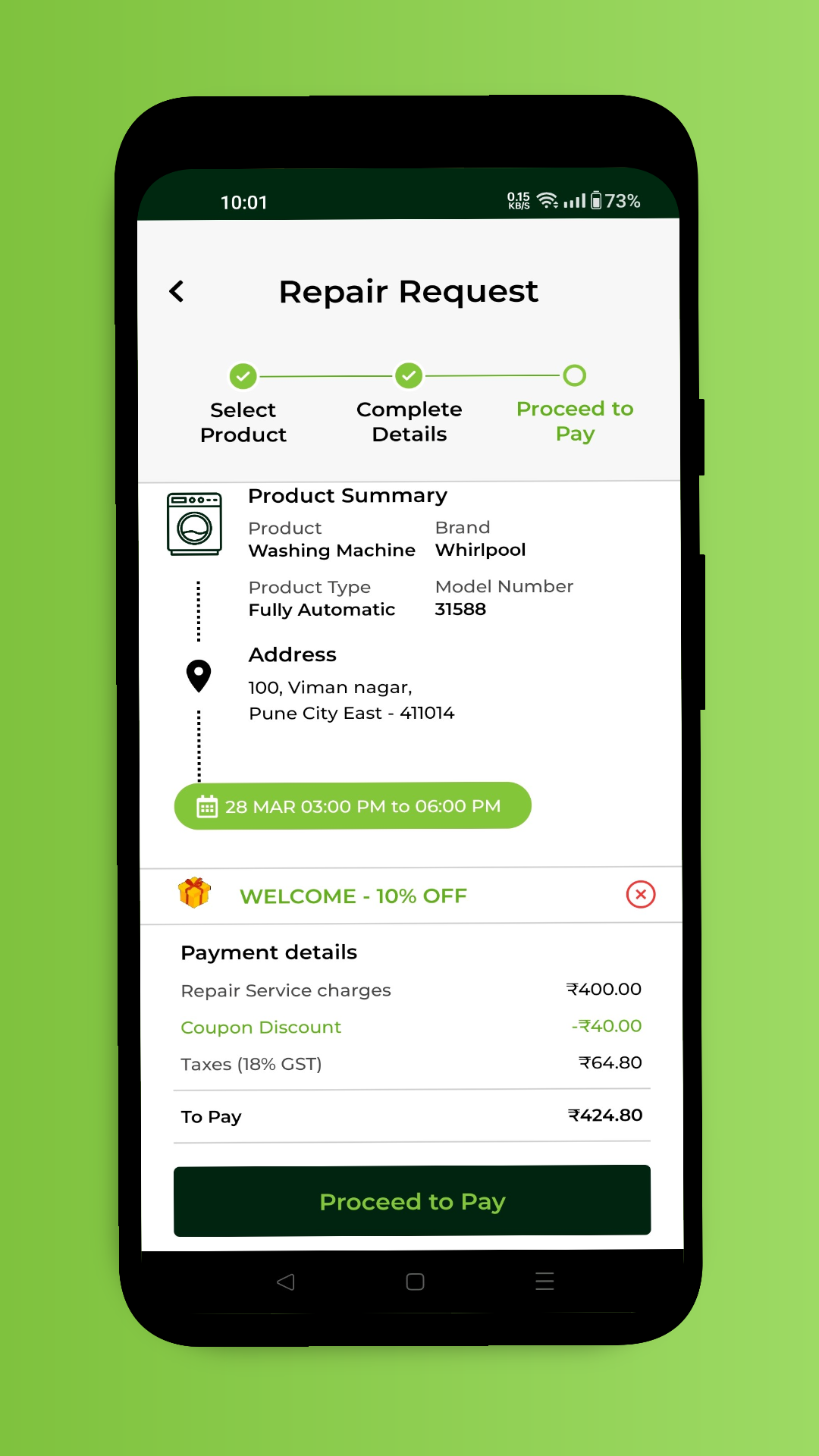
Select Product → Complete Details → Proceed to Pay. The stepper is always on screen, each step ends in one clear primary action, and nothing is asked twice.
Repair requests need a lot of information — product, brand, model, issues, address, slot — which is exactly the kind of form people abandon.
Product, issues and address appear as read-only summaries with Change and Edit affordances, so review feels like confirming rather than filling in a form again.
Pricing anxiety: users would not commit without knowing what a visit costs and what it includes.
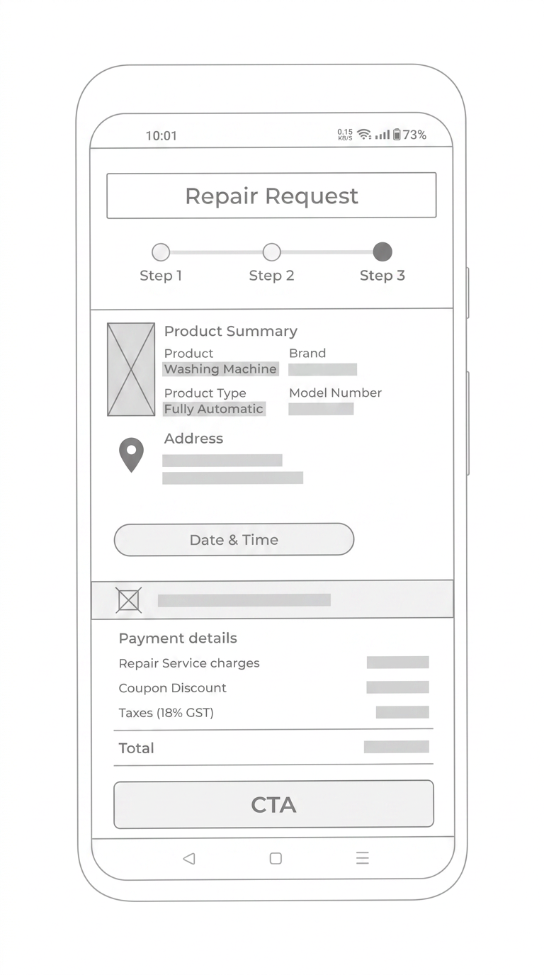
Service charges appear beside the chosen slot with a plain-language note on what they include, and the payment screen itemises charge, coupon discount and 18% GST before the total.
Payments, coupons and GST had to be readable at a glance for a non-technical audience across a wide range of Android devices.
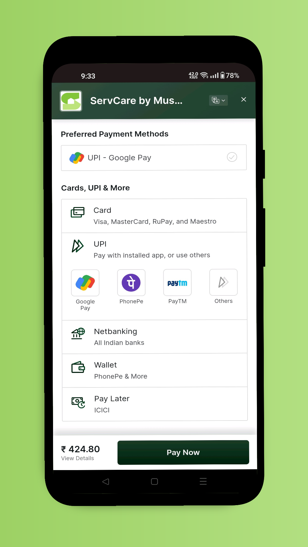
A preferred-method row surfaces the user's usual UPI app, with cards, UPI, netbanking, wallets and pay-later underneath — the total and Pay Now stay pinned to the bottom bar.
After booking, users had no sense of what happens next, which drove support calls.
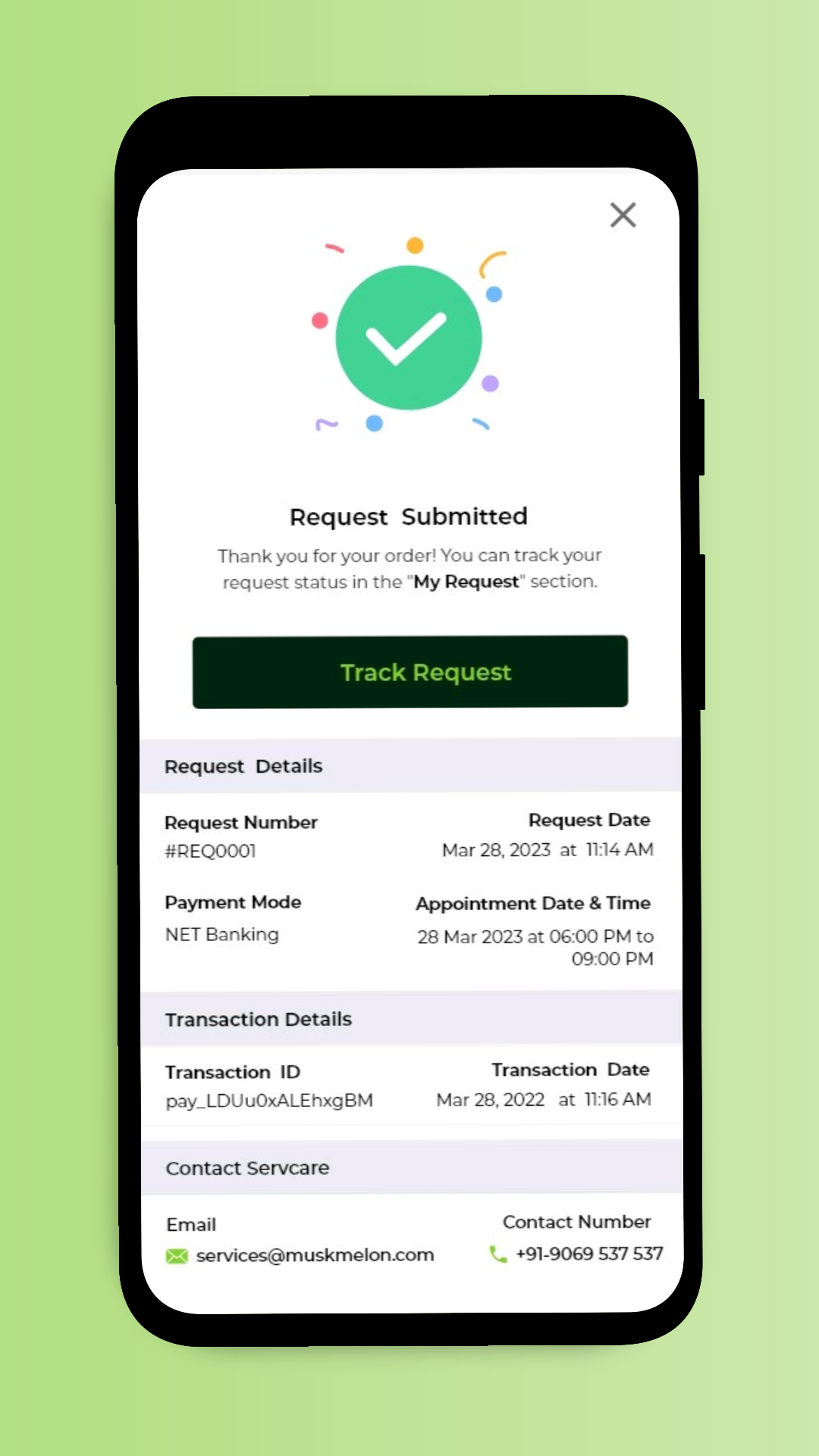
The success screen gives request number, appointment window, payment mode, transaction details and a Track Request button, plus support contacts — the exact set of things people used to phone in to ask.
05
Design process
01
Information architecture
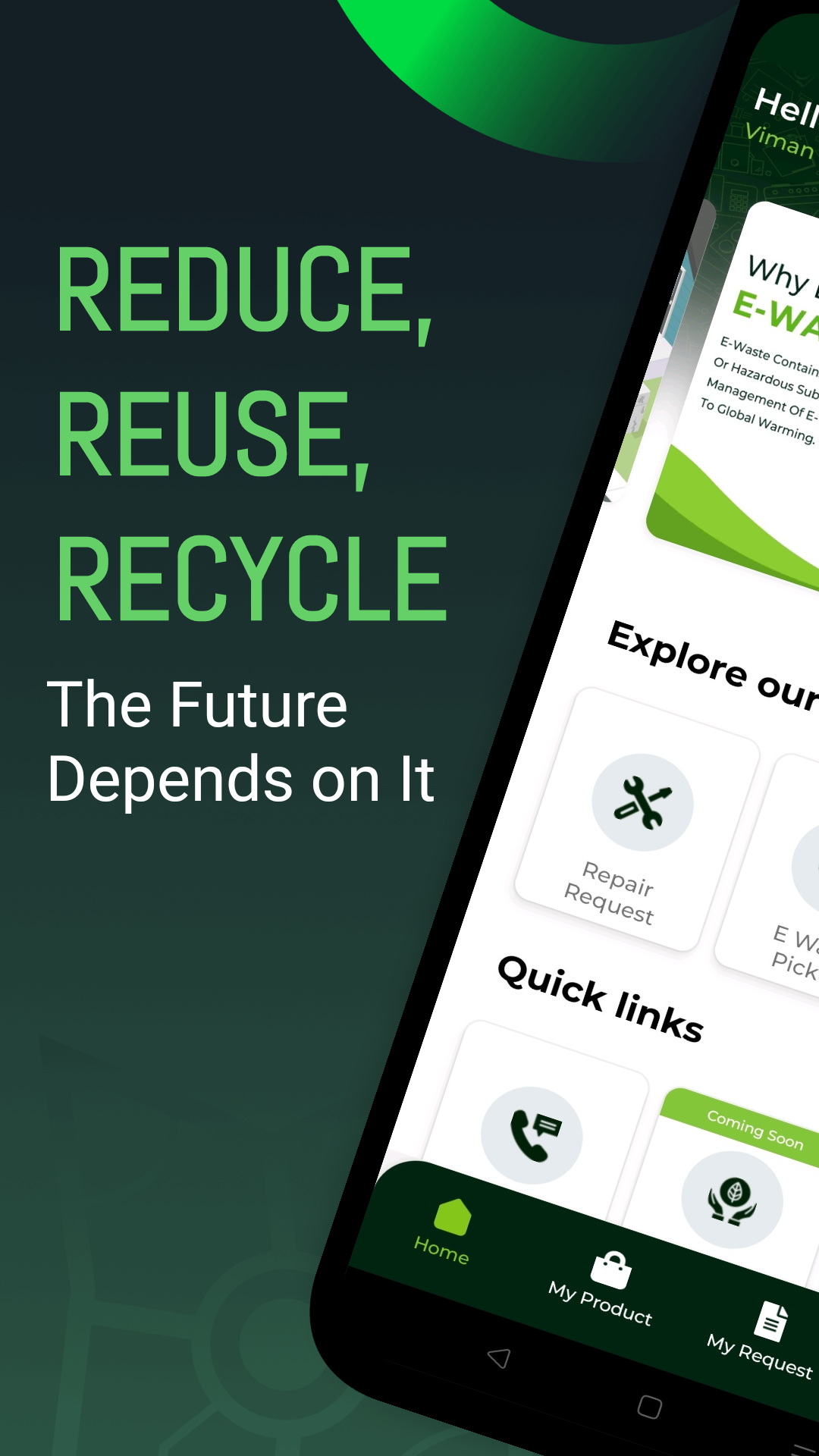
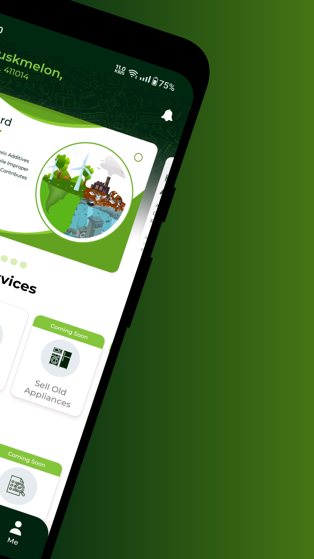
Split the home screen into 'Explore our services' and 'Quick links', with an education card explaining why e-waste matters. Coming-soon services stay visible but clearly labelled, so the roadmap builds trust instead of dead ends. Bottom navigation reduced to Home, My Product, My Request and Me.
02
Flow design
Modelled the repair request as three explicit steps — Select Product, Complete Details, Proceed to Pay — with a persistent stepper so users always know where they are and how much is left. Saved products under My Product let repeat users skip step one entirely.
03
UI & design system
Built a green-and-charcoal system on the ServCare brand: high-contrast dark primary buttons, generous 48dp targets, summary cards with inline Edit/Change actions, and a type scale that stays legible for older users. Every screen was checked on small, low-density Android devices first.
06
Validation & handoff
Prototype & testing
Tested clickable Figma prototypes with first-time users. Two findings reshaped the flow: service charges had to be stated on the details screen before payment, and the appointment slot needed to read as a date-time chip rather than a form field.
Handoff & release
Delivered Dev Mode specs for the payment sheet, coupon, GST breakdown and confirmation states, plus empty, error and coming-soon states. Supported QA through the Play Store release and reviewed store screenshots for the listing.
07
Final UI / key screens
08
Outcome & reflection
Documented project outputs
- 3 steps — From request to payment
- < 2 min — Typical booking time
- Live — On Play Store & App Store
- 1 tap — Repeat booking via saved products
Trust in a service app is built by removing uncertainty, not by adding features. The moment we surfaced the exact price and the exact appointment window before payment, the flow stopped feeling like a form and started feeling like a booking.