Education · Website · UI/UX Design
Kinderia
Designing a warm, trustworthy and parent-focused digital experience for Kinderia, a preschool and daycare in Pune.
01
Overview
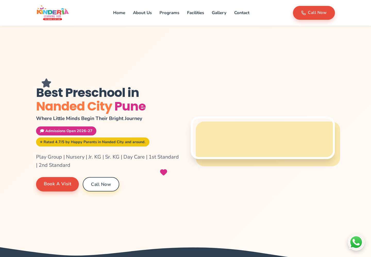
Kinderia is a preschool and daycare in Nanded City, Pune, offering Play Group, Nursery, Junior KG, Senior KG, Day Care, 1st Standard and 2nd Standard. The brief was a website that a parent could scan in a couple of minutes and come away knowing whether the school fits their child — what is taught at each age, how safe the campus is, what daily life looks like, and how to enquire.
- Role
- Freelance UI/UX Designer — UX strategy, IA, wireframes, UI, responsive design, prototyping
- Timeline
- Freelance client project
- Tools
- Figma, FigJam
- Platform
- Responsive web (kinderia.in)
02
The problem
- Parents evaluate a school quickly, so trust signals had to appear before any detailed content.
- Seven age-based programs needed to be distinguishable at a glance without turning the page into a table.
- Safety, staffing and campus facilities are the deciding factors, yet they are the easiest content to bury.
- Most visits come from a phone, so the whole hierarchy had to hold at a narrow width.
- Admission enquiry had to stay reachable from anywhere on the page without interrupting reading.
03
Define
The design direction focused on these documented product decisions:
Parents evaluate a school quickly, so trust signals had to appear before any detailed content.
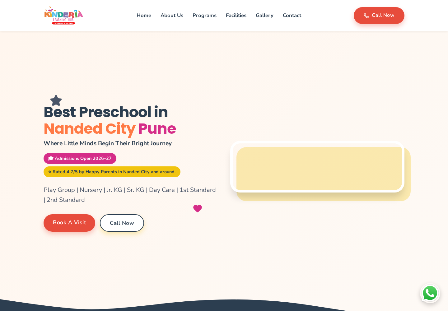
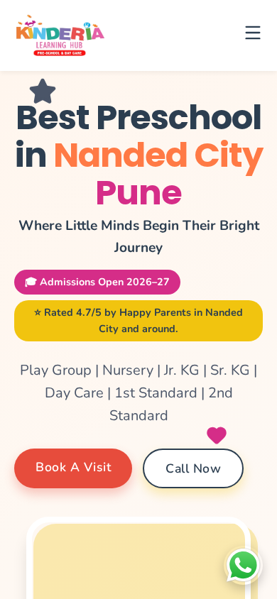
The hero states the school, the location and the age range it covers, alongside the current admission status and the parent rating, so a visitor knows relevance and availability before scrolling.
Seven age-based programs needed to be distinguishable at a glance without turning the page into a table.
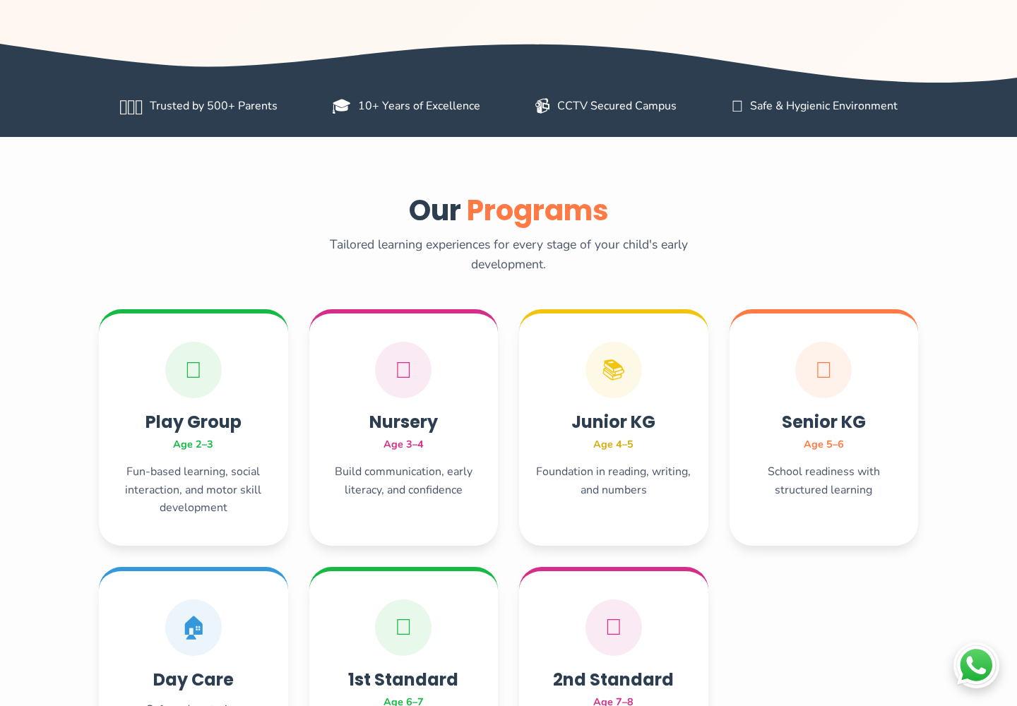
Parent count, years running, CCTV-monitored classrooms and hygiene sit on a dark band directly under the hero — the safety questions answered before programs are described.
Safety, staffing and campus facilities are the deciding factors, yet they are the easiest content to bury.
Each of the seven programs is one card with the age range and a single line of description, colour-coded along the top edge so a parent scans to their child's age instead of reading the whole set.
Most visits come from a phone, so the whole hierarchy had to hold at a narrow width.
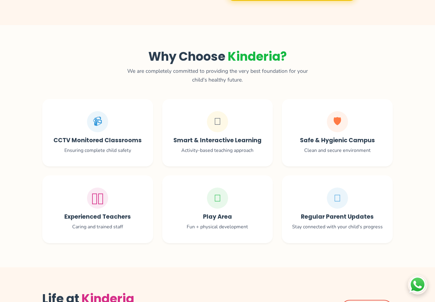
Safety, teaching approach, hygiene, staff, play area and parent updates are each reduced to a title and one supporting line, keeping the deciding factors visible rather than buried in prose.
Admission enquiry had to stay reachable from anywhere on the page without interrupting reading.
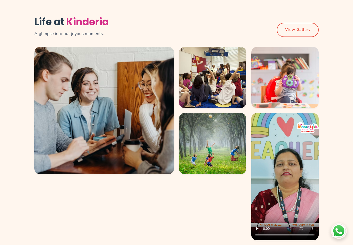
A photo and video grid of classrooms, activities and teachers gives parents the environment directly, with a gallery link for anyone who wants more.
04
Design process
01
UX strategy
Framed the site around one question a parent is trying to answer — is this the right place for my child — and ordered the content by how that question gets answered: reassurance, programs, environment, then admission.
02
Information architecture
Defined the structure as Home → About Kinderia → Programs → Activities → Facilities → Gallery → Admissions / Enquiry → Contact, so the page mirrors a parent's evaluation sequence rather than the school's internal departments.
03
Wireframes & layout exploration
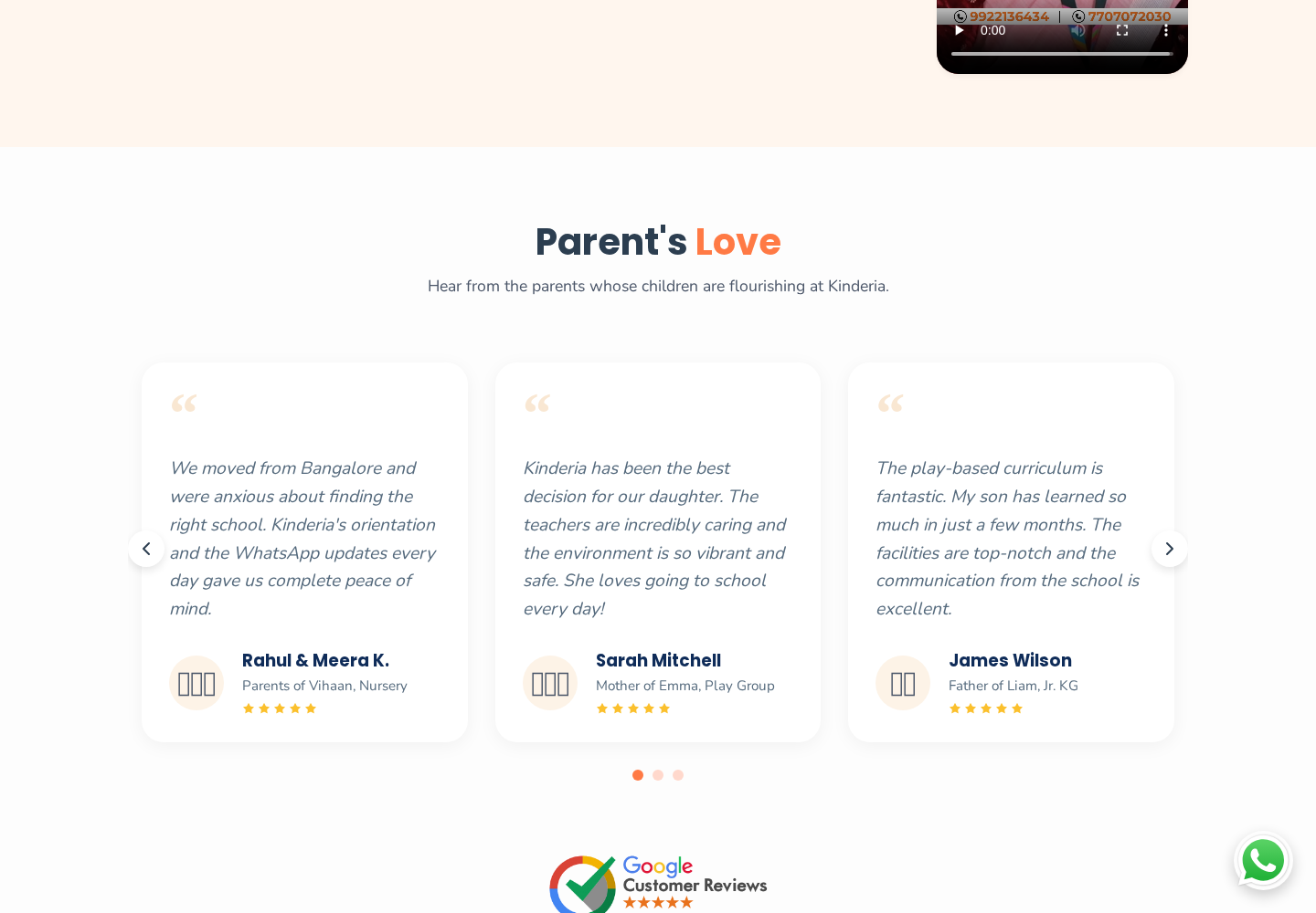
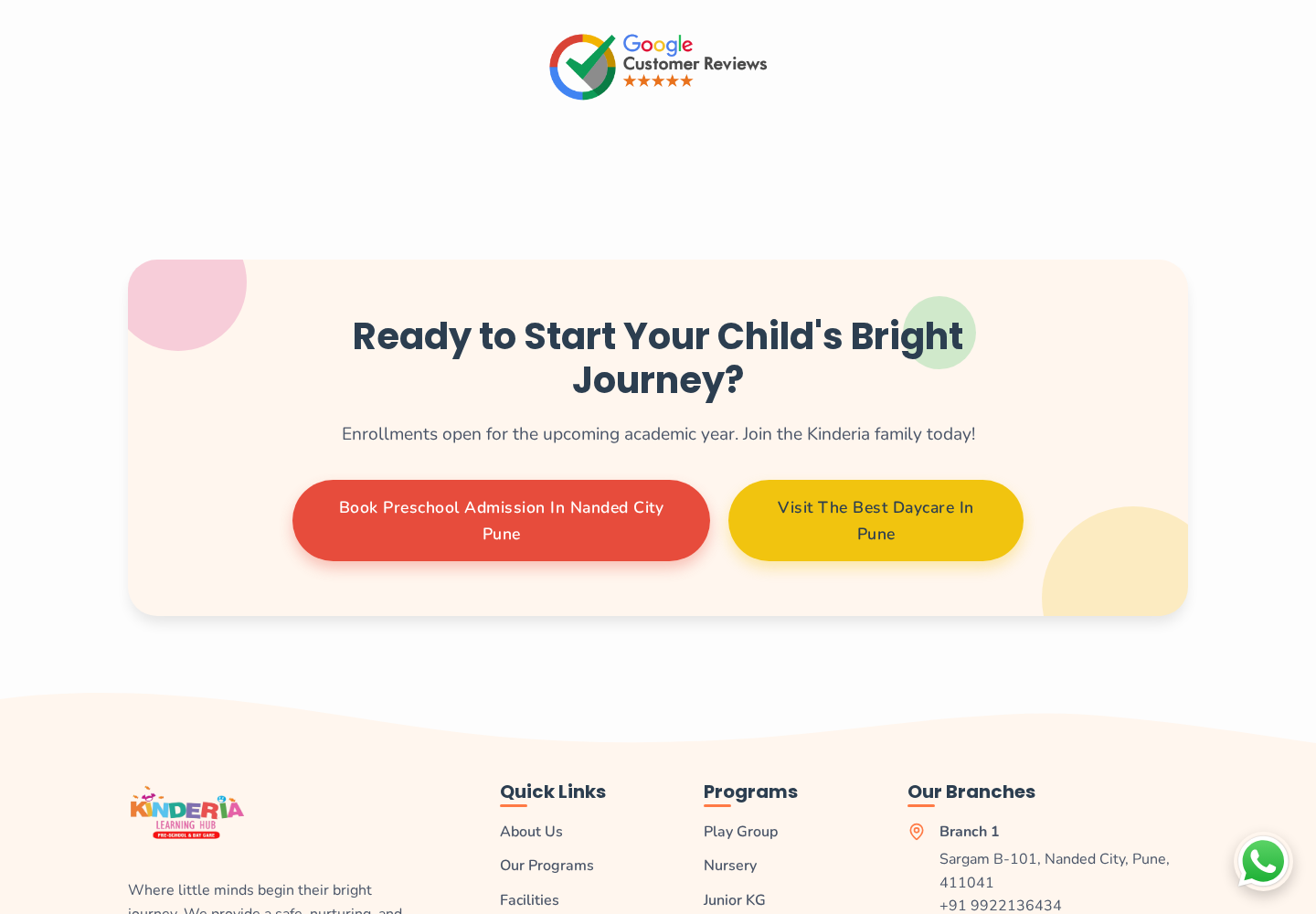
Blocked out the homepage sequence in low fidelity — hero with age range and admission status, trust strip, program grid, school introduction, reasons to choose, life-at-school gallery, parent feedback, closing enquiry panel — and tested the stacking order at mobile width before any visual design.
04
Visual design
Built a warm palette of cream, coral, pink, yellow and green against a dark navy accent, with a rounded geometric sans, generous line height and a card per program colour-coded by age band so the grid is scannable rather than read line by line.
05
Responsive design & prototyping
Prototyped the full scroll and reduced the layout for tablet and mobile: multi-column grids collapse to one, the headline breaks across three lines, buttons become full-width taps, and the call action stays reachable in the header.
05
Final UI / key screens
06
Outcome & reflection
Documented project outputs
- 8 sections — Ordered to a parent's evaluation sequence
- 7 programs — Age-coded from Play Group to 2nd Standard
- 3 breakpoints — Desktop, tablet and mobile layouts
- 2 branches — Locations and contacts surfaced site-wide
On a consumer marketing site the hierarchy is the product. Ordering the page the way a parent forms a decision — reassurance, then fit, then environment, then enquiry — did more for clarity than any individual screen treatment.