Clean Tech · Web3 · IoT · ESG
Impactility
Sustainability, climate, e-waste and ecosystem initiatives are inherently complex — the challenge was to make Impactility's offering understandable and navigable without losing its business value or technical credibility.

01
Overview
Impactility is a cleantech company that uses emerging technologies to create measurable sustainability impact across e-waste management, nature-based solutions, climate education and ecosystem development.
I designed user-centric digital experiences for the company, working with a multidisciplinary technology team to turn sustainability-focused requirements into intuitive, scalable product interfaces.
- Role
- UI/UX Designer — user flows, wireframes, high-fidelity UI, and collaboration with developers and stakeholders.
- Team
- Cross-functional, flat-hierarchy team spanning UI/UX, project management, software engineering, full-stack development and Web3/DevOps.
- Tools
- Figma, FigJam, Adobe Illustrator, plus collaboration and developer-handoff tools.
- Platform
- Web and mobile
02
The problem
The core challenge was to make Impactility's sustainability-focused solutions easier for users and stakeholders to understand, navigate and engage with. The subject matter — climate, e-waste, ecosystems, emerging technology — carried a lot of inherent complexity that had to be simplified without stripping out its business value or technical credibility.
The stakeholder ask was a modern, professional, user-centric digital experience that clearly communicates what Impactility offers, builds trust, improves usability and guides people towards the relevant action or solution.
Constraints
- Complex sustainability and technology concepts had to read as plain, digestible information.
- Multiple audiences — businesses, partners and end users — shared the same experience.
- The design had to stay aligned with Impactility's sustainability-focused identity.
- Navigation and information architecture had to stay intuitive across several services.
03
Discovery
There was no formal research phase on this project. Design decisions were informed by stakeholder direction, requirement discussions with the engineering and project teams, and the market context around the sustainability services being offered — not by moderated studies or analytics.
I'm stating that plainly rather than presenting reviews as research: what I had going in was a business brief and domain expertise from the people building the technology, and the design was shaped and challenged against that input.
04
Define
The design goals I worked to, as I understood them from the brief:
- Communicate complex sustainability offerings in a simple, credible way.
- Give the separate service lines one consistent visual and interaction language.
- Keep navigation and information architecture intuitive across multiple services.
- Build trust for business and partner audiences through a professional, modern presence.
- Produce reusable components and specifications that developers could implement directly.
05
Design process
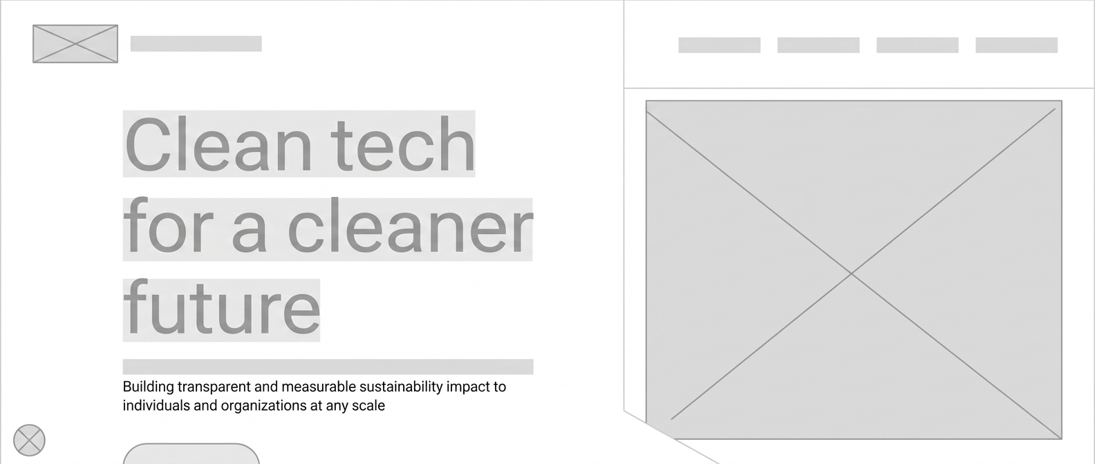
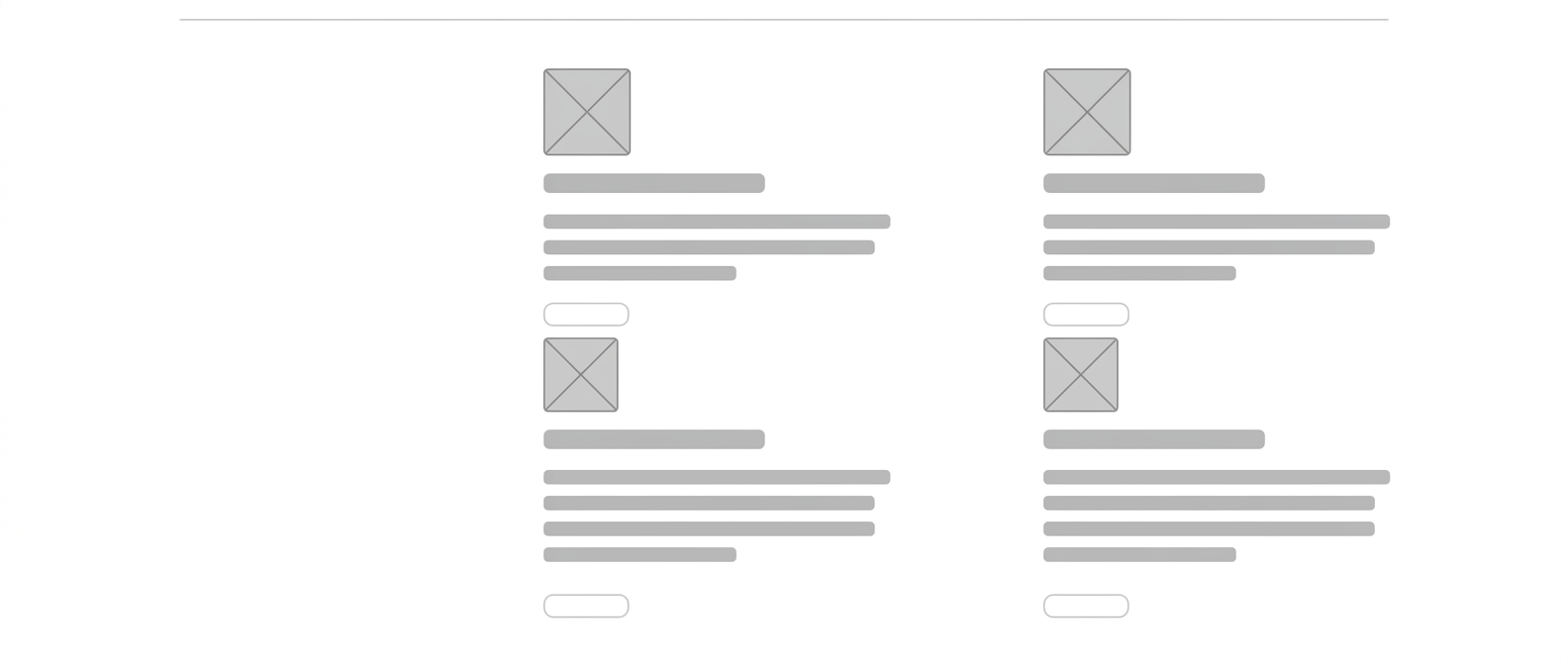
Early structure was tested in low fidelity before any brand was applied — a stacked layout for the homepage and four equal blocks for the technology pillars, each reduced to one plain sentence.
01
Requirement understanding
Worked with stakeholders and the engineering team to understand the business objectives, the services to be communicated and the technical constraints behind each product line.
02
Structure & direction
Defined user flows, information architecture and low-fidelity structure first, so the content hierarchy was agreed before any visual language was applied.
03
Concepts & high-fidelity UI
Explored different layout, typography, component and content-hierarchy approaches to create a modern experience while holding on to Impactility's sustainability-focused identity.
04
Stakeholder feedback
Reviewed the designs with stakeholders and the project team. Feedback centred on content clarity, navigation, visual hierarchy, business requirements and overall usability.
05
Iteration & refinement
Ran multiple iterations — simplifying information, refining layouts, adjusting interaction patterns and components, and strengthening consistency across screens.
06
Design handoff
Once key screens and flows were aligned with stakeholder expectations, final designs and reusable components were prepared for development, with implementation feasibility considered throughout.
Validation came through stakeholder and team reviews, design walkthroughs and iterative feedback. There was no moderated usability study or quantitative user testing, so the decisions were validated against stakeholder requirements, business goals, usability principles and implementation constraints.
06
Brand system to product
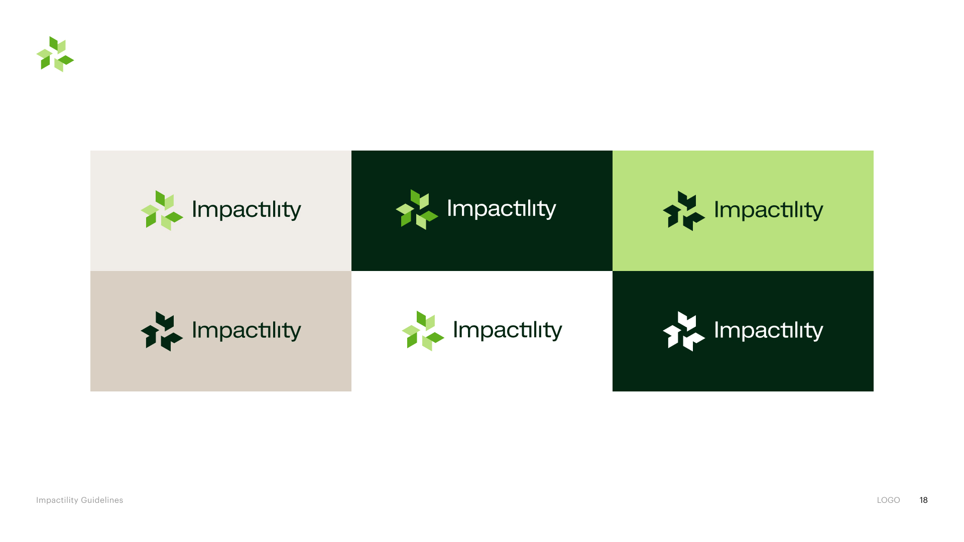
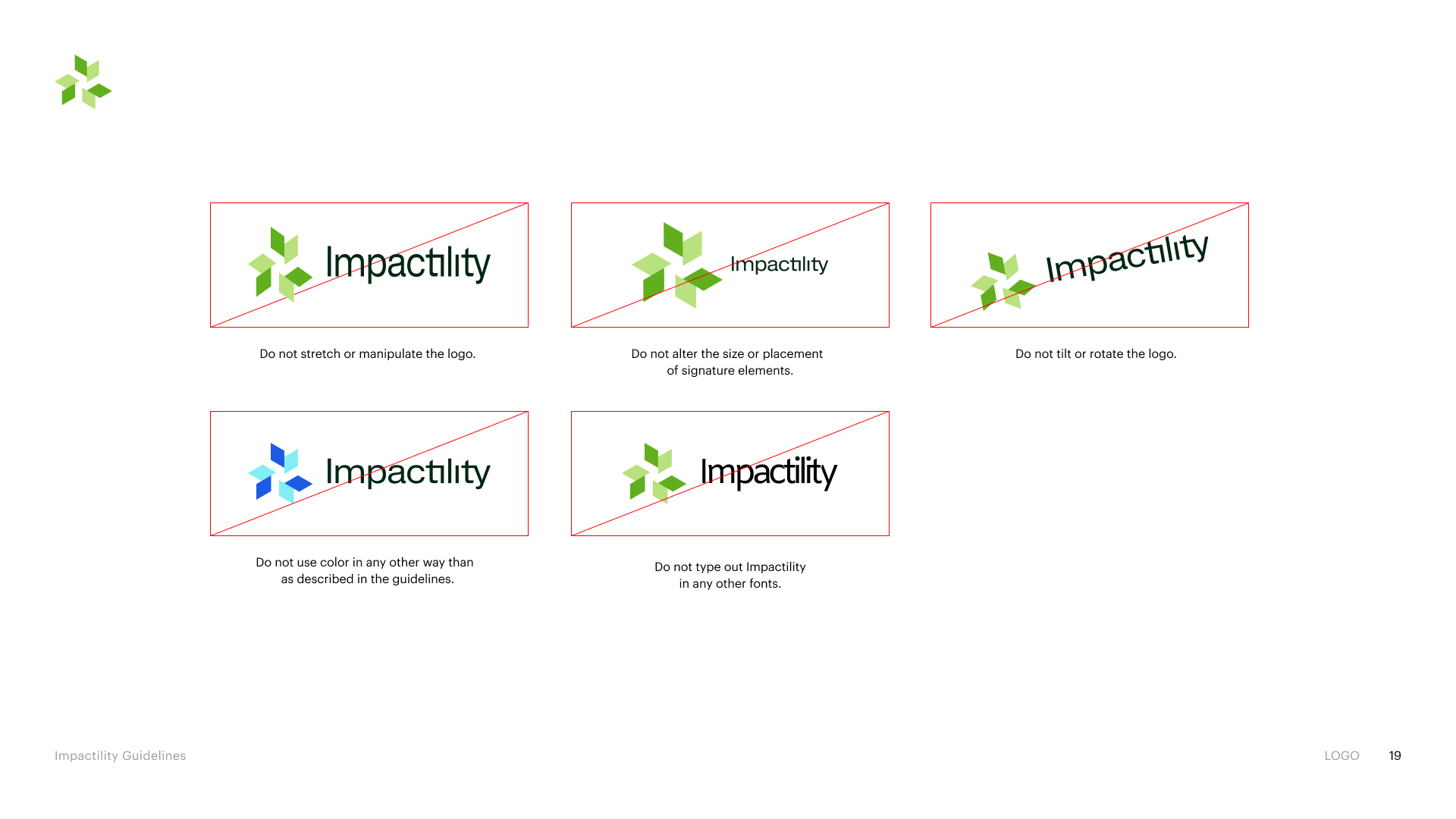
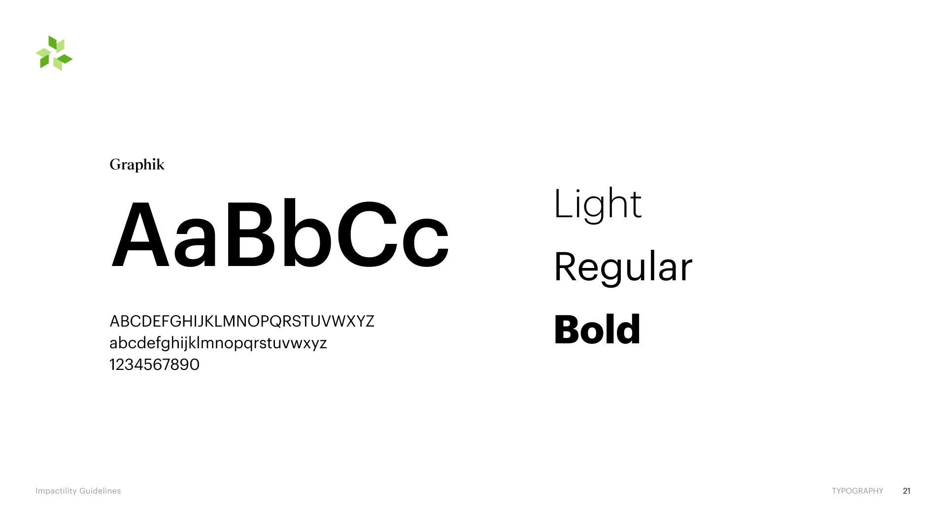
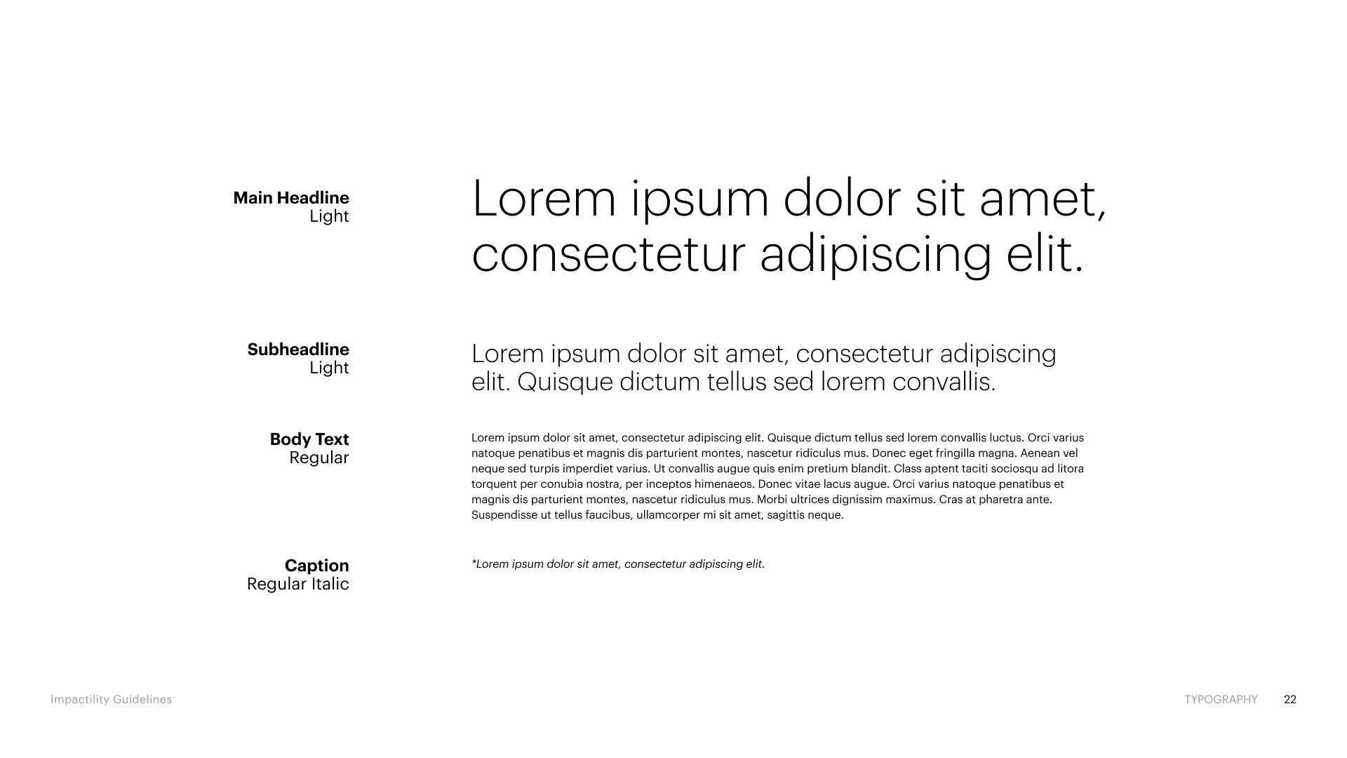
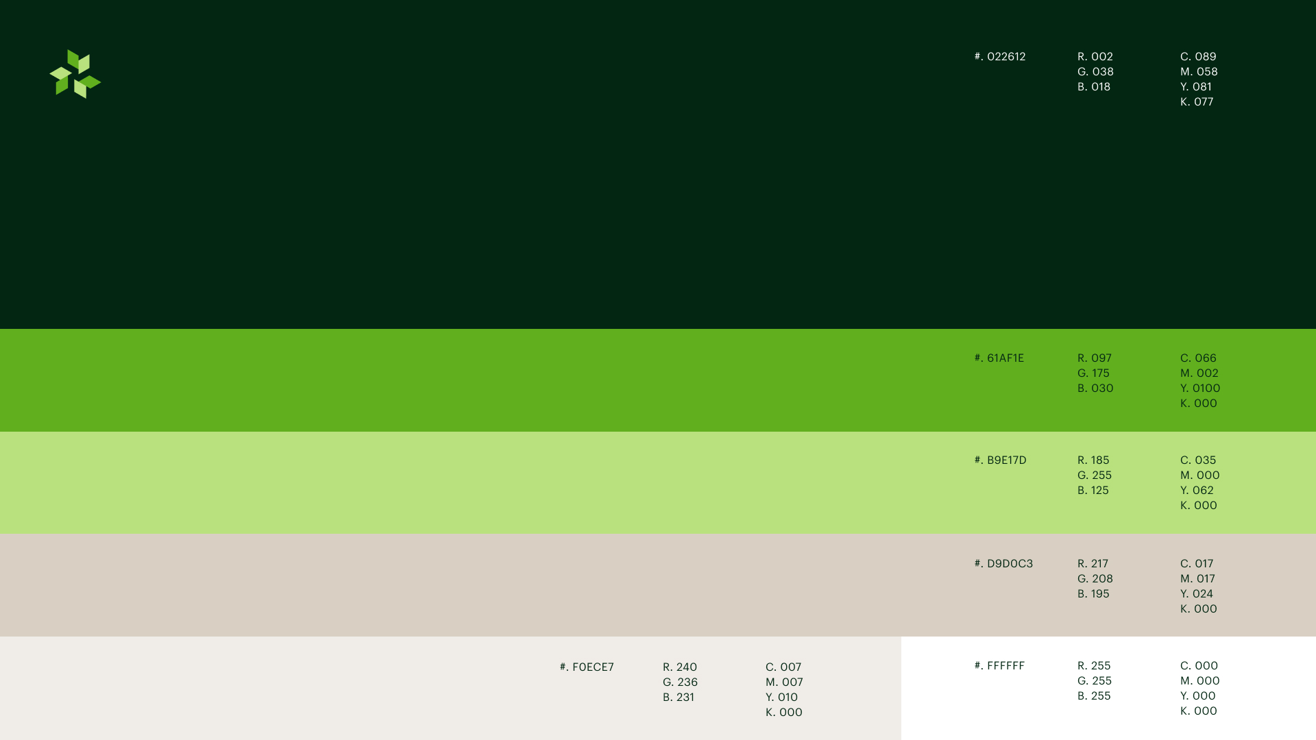
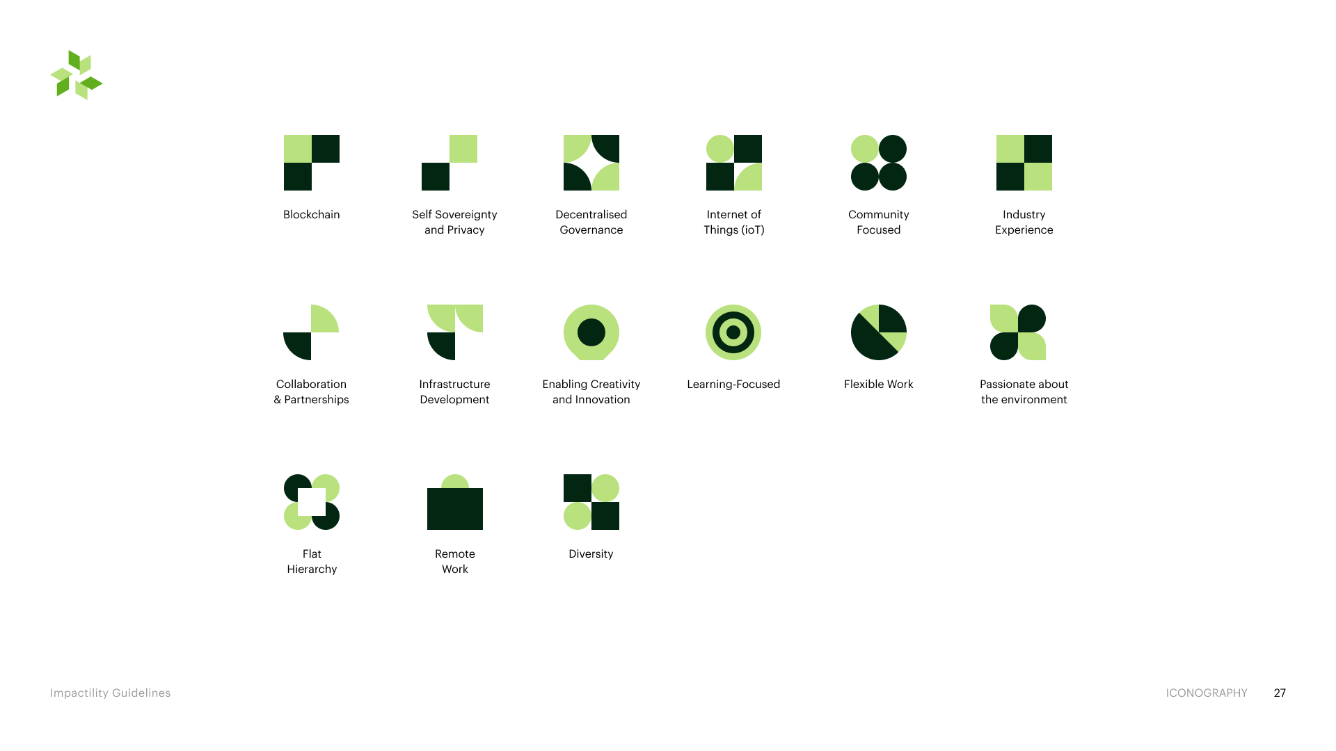
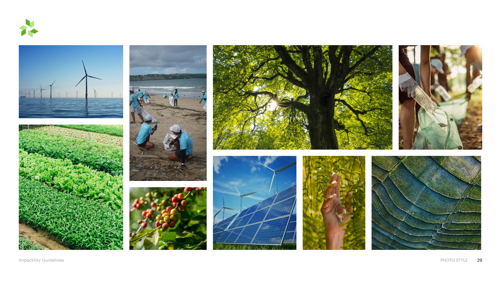
A deep-green and lime identity built on Graphik, with a geometric icon set derived from the mark. It gave every service line a single surface language and became the reference the UI kit and product screens were built from.

07
Final UI / key screens
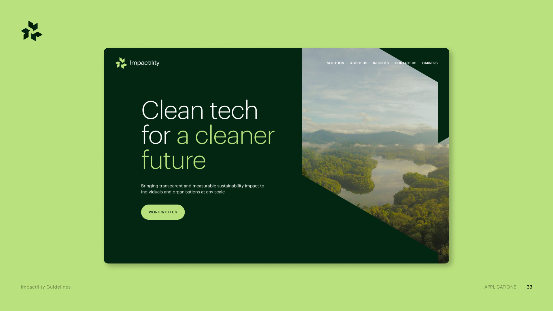
A stacked narrative homepage: the proposition sits above the fold in plain language, with each technology pillar reduced to one sentence so a first-time visitor can place the offer before scrolling into detail.
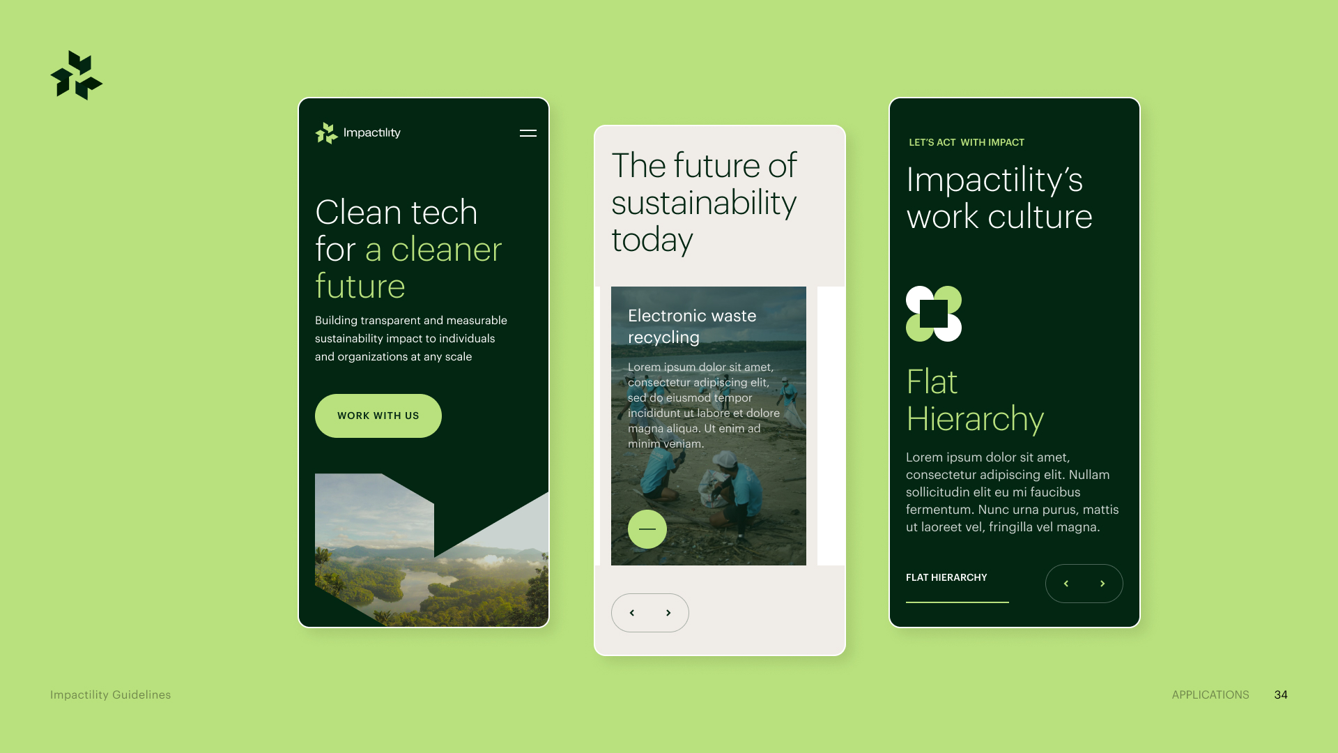
The same hierarchy reflowed to a single column, with pillar blocks and calls to action kept at consistent, thumb-reachable sizes drawn from the shared component set.
08
Outcome & reflection
What shipped
- Refined user flows and information architecture
- High-fidelity UI designs
- Responsive interface patterns
- Reusable UI components
- Improved content hierarchy and navigation
- Stakeholder-reviewed design direction
- Developer-ready specifications and handoff
~40%
Reduction in developer handoff time
Business / process metric
Taking the project further, I would introduce earlier and more structured user validation — testing the most important journeys with representative users before the visual design is locked. I would also set measurable UX success criteria such as task completion, navigation success, engagement with key calls to action and drop-off points, so decisions could be judged on evidence as well as reasoning.
The design evolved through continuous stakeholder feedback and iteration into a more structured, consistent and user-focused experience; the biggest opportunity was validating key assumptions with real users and measurable data earlier.